
Ridge Logo
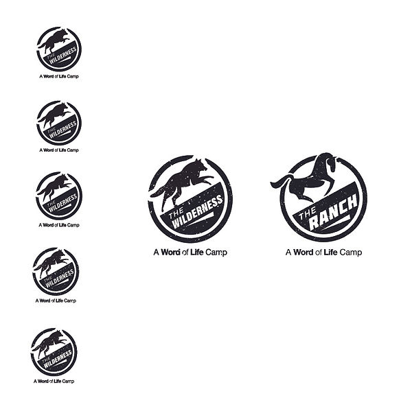
Word of Life's logo "The Wild" needed a name change and a visual update. The process started with creating an original wolf graphic, seeing the graphic in the context of the circle it had to be housed in, and landing on a design that could be paired with "The Ranch" logo – an existing camp logo that the Ridge would be paired with at times.

The animal representing the camp was to be updated from a tiger to a wolf. To begin, I began by making original wolf-like graphics to choose from.

Once the wolf shapes were made, I tested them in the space they would live in – a circle with the bottom half containing the camp name (consistent with other Word of Life youth camps).

After multiple renderings of the wolf shape, the final version was picked that would pair nicely with The Ranch logo without being to varied in style.

The client directed a change in the name to "The Ridge" and the need to incorporate "Word of Life" into the logo itself, resulting in the final logo below!
